Wednesday, 28 October 2009

Potato Printing

So...potato printing. Made me feel like a child again and found it a bit too juveneille. I'm always quite precise with my final images and don't like the unpredictable aspect of the paint when using potatoes. Plus, it's a very limited way of printing. However, it was still quite fun. The bottom two prints are on some of the paper I hand made in the ceramics room. It was quite nice with the potato prints on as it looked quite hand crafted and quaint.


Tuesday, 27 October 2009

The British Museum exhibition

I decided to visit my home city of London for a couple of days, hoping to visit the print room at The British Museum and catch the 'Revolution on paper: Mexican prints 1910-1960' exhibition. However both were closed and were to be re-opened the day after I would return to Leeds, which was really unfortunate. However, they had a small room open with a selection of different prints and postcards as a preview to the Mexican print exhibition. Photography wasn't allowed, but the prints varied from intricate woodcuts to beautiful etchings of skeletons and death.

I am planning to go back again on November 1st to catch the Day of the Dead celebration at the British museum, where I'll hopefully get to take part in workshops such as sugar skull making, and have a proper look at the print rooms.

Here is a poster I managed to get and a couple of the postcards.


Diego Rivera, "The Day of the Dead" (1923-1924), Ministry of Education, Mexico City.


Day of the Dead

(Above are figures created by an artist for the Day of the Dead celebration. Miniature figures like this are often sold in Mexico and now in the UK too, to mark and celebrate The Day of the Dead.)


After playing around and experimenting with different printing techniques, I feel I still need to set myself a stricter idea of what kind of work I would like to have produced at the end of this; a running theme to give me some direction.

I would like to explore producing prints around the Mexican celebration, Day of the Dead. My illustration and tattoo designs have often included imagery from this such as sugar skulls, and have always found it an amazing celebration, visually and conceptually. The holiday allows family and friends to gather together, pray for and remember those who have passed away. The celebration takes place on the 1st and 2nd of November, connecting with a Catholic holiday called All Saints Day. Traditions such as building alters and making sugar skulls, visiting graves and making the favourite foods of the departed, take place.

I would like to create some illustrations and prints around this theme (possibly post cards celebrating the day).

Tuesday, 20 October 2009

Duffield Printers

Today I visited Duffield Printers on Kirtkstall Road. We were shown around by a lovely man called Clive Elston, Sales Rep for Duffield.


I had the opportunity to ask Clive various questions to help understand how they run their company, the services they provide and any trends in printing at the moment. He commented that a lot of designers seem to be employing individual printers recently, rather than bigger companies. He also said that in the past, clients tended to choose their printer by the level of quality they offer, but due to the current economic crisis, they have been looking for the lowest prices instead.

He claimed that Duffield have a lot of loyal customers, as they offer competitive prices and will normally be willing to try and beat prices offered by other companies. It is important to build up a good reputation for your printing company to be continually successful and not lose customers.

The main programme they use is Quark Express. We were shown the stages they go through when checking a document is ready for print. It involved the typical checks, such as if there is a 3mm bleed, and if the fonts and image files have been supplied with the document as well. All images must be saved as PDFs, and images must be CMYK (although can be changed by them from RGB).

They use a software called 'Cockpit' to put the postscript in to, which is then prepared and automatically creates PDFs. It also puts the pages in to the correct order for printing. (Interestingly, the lady who did this used to study Graphic Design at Leeds Art college.) The document is then checked over numerous times to ensure there is no mistakes at all and that everything is as the client wished e.g. check margins and separations. Plates are then prepared and sent over to the printer. The images are put on to the plates via laser. There are 4 plates (one for each CMYK).

I was then shown in to the room with the machines in, which did things such as automatically fold or stitch various sections together once printed.

Duffield also offers service such as small laminating jobs. One thing they do which makes them appealing as an easy to use company, is send off documents to outside suppliers to have extra things done to them that they may not offer. e.g. embossing.

I asked if people generally knew what paper they wanted or whether they gave advice on this. Clive said that they often recommended paper weights to clients. He also told me that Duffield print in any numbers from single prints to 50,000. However, they do occasionally turn jobs down that they feel they can't offer competitive prices on e.g. newspaper or magazine printing is much cheaper to be done at a web printers.

It was an interesting experience visiting a professional printers, as not only would I now know what to consider when wanting my own work printed professionally, but I also know the various ways in which this can be done. It is good to have a comparison of these types of computer generated print against those more hand crafted print techniques such as screen printing.

Monday, 19 October 2009

Photo Etching

Photo etching is the process of putting an image on to a copper plate, then etching in to it by putting it in to a chemical bath. I chose not to etch in to the plate, as you have to pay for the plate if you do so and mine was fairly large, and therefore quite expensive. However I still printed with the photo after it had been put on to the plate, and produced some nice outcomes.


Below are the three prints I got from my copper plate. I attempted printing the inked up green plate twice to see what it would look like, but it's not like letter pressing; the faded appearance of the print loses too much detail. However I am pleased with the red print as it gives the image a vintage feel to it. I probably wouldn't use this form of printing again as it is very time consuming and not that suitable for the kind of illustration I hope to print in the future. It can also be an expensive process.


Letterpress Printing


I've never given letterpress a try before, and as it's an old school way of printing from back in the 15th century I thought it was pretty important to experience it. After Placing all of the fiddly little letters, middles and punctuation and placing them in the metal frame it turns in to quite an efficient way of printing text repetitively, as the process of actually putting the paper through the letterpress is pretty simple and fast. Although the final outcome can appear similar to one produced through screen printing text, it's nice to be able to play about with the heaviness of the text through using different amounts of paper to stuff the back with.


This is a print on to cartridge paper with plenty of stuffing layers put through with it to give a strong, crisp print.

This is also printed on to cartridge paper but with only a couple of sheets behind it when I ran it through the press. It gives a faded, less defined print.

Printing on to tissue paper makes the text appear strong but delicate.

When letterpress printing on to acetate you achieve perhaps the crispest, most defined effect. However when scanning it in it has appeared dark and with a couple of stains from the surfaces in the print room.

This is a print on to newsprint. Unless you put a little more paper through with it, it's not as clear and thick as on cartridge paper.

Friday, 16 October 2009

Wallpaper collection at Temple Newsam


'Temple Newsam is one of the great historic estates in England. Set within over 1500 acres of parkland, woodland and farmland landscaped by Capability Brown in the 18th century, it is a magnificent Tudor–Jacobean mansion. Famous as the birthplace of Lord Darnley and home to the Ingram family for over 300 years, the mansion houses rich collections of works of art.' (Introduction on the Temple Newsam website).

Nick advised that myself and anyone else interested in looking at other areas of print might be advised to pay a visit to temple Newsam. Myself and a fellow second year viscom student went and were able to look at their collection of vintage wallpapers, as well as recreations of authentic 18th century wallpaper around the mansion itself. Some of the designs were beautiful, and some very dated. It was interesting to see the use of flock on many of the wallpapers.


The image below is a photo taken from a room we visited displaying historic textiles that were given to temple Newsam by a private collector and antique dealer, Roger Warner.

Wednesday, 14 October 2009

Screen Printing


I created an image of a rose, using a new layer on Illustrator, behind my gypsy girl tattoo head that I will screen print in a different colour underneath the oringinal image. I will do these prints on normal cartridge paper and then trial with printing the image of the head on to tracing paper and place that over the image of the rose.

The bottom image is the tracing paper overlay. I think this works really nicely as a finished piece and adds some depth to a simple illustration. I would like to trial screen printing further using this technique and experimenting with various types of paper.

Mono-print


I've tried mono-print before a couple of years ago, but only really basically so decided to try it briefly again. I cut out some rough shapes from paper and placed them on my paper before covering my plastic sheet with various inks and put them together through the roller. The handmade effect it produces is quite nice as it's very different to the crispness you achieve with screen printing, however I don't like the unpredictable aspect of this way of printing and it's hard and time consuming to create more than one identical print.

Here are a couple of the outcomes...

Illustrator Workshop


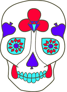
I used Illustrator for my FMP at the end of year one so am familiar with how to use the pen tool etc. (made easier by also using my graphics tablet) but attended the Illustrator workshop anyway to re-familiarise myself. After doing some simple exercises set up for us, I traced an old sugar skull I had sketched out last year and added some colour. My lines aren't precise enough and it's not well thought out, but just a trial....

Planning Screen Prints...


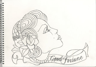
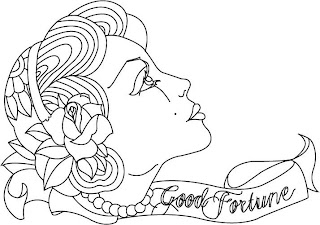
The main area of print I want to become completely comfortable with doing is screen print. I want to eventually use this process to create posters and flyers for a mini brief I will set myself, but for now I'm scanning in some of my rough tattoo designs to create vector images on Adobe Illustrator which I will then use to experiment screen printing with. This is one I only have as a pencil outline so far, but it doesn't matter. It almost makes it easier for me to trace over properly using the pen tool in Illustrator. The image below the pencil outline is the Illustrator created design.

Communication Technology 2

Second Comm Tech brief. This time round I know what I want to achieve from it and roughly how I'll go about doing that. My main area I will work within this is Illustration for Print.

Rationale
I hope to improve my knowledge of the different areas of print that are available to me and produce a variety of examples of these through poster, flyer and tattoo design.