Showing posts with label Comm Tech 2. Show all posts

Tuesday, 24 November 2009

The Day of the Dead Prints 2


This is my second attempt at CMYK printing one of my posters. I had trouble with printing this one, and not because of the image but because of the brown tape I used to mask off each unused image. The tape the print room had been sent was a bad batch and was unusually sticky. Therefore, even once thoroughly blast washing the screen down in the booth, when I peeled off the tape it left a sticky film which turned out to be almost impossible to remove completely. I had to rinse the screen as usual, then clean it with a special screen wash using two cloths on each side and scrubbing. Then rinse it again and wait to dry. Sometimes I had to repeat this process twice, which meant it took me over an hour just to screen print one colour.


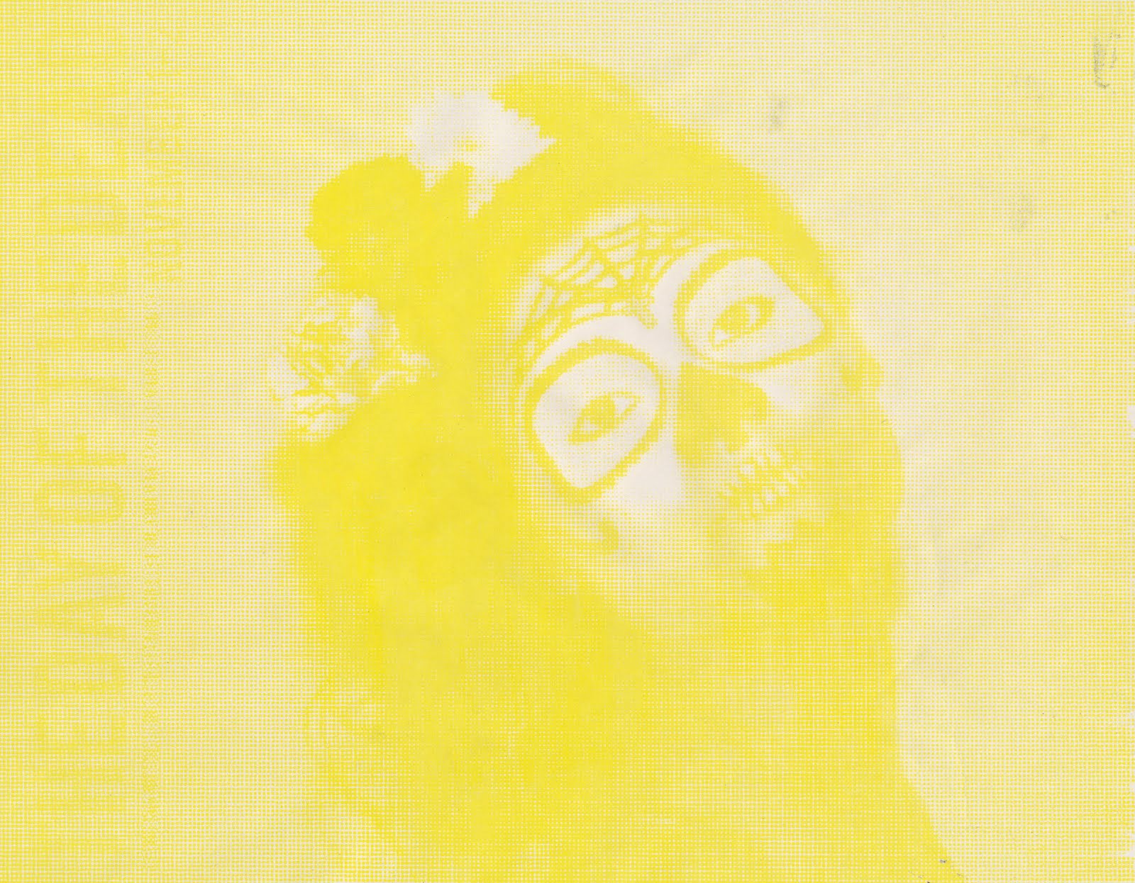


I had a second problem, which was that because of the amount of screen wash I had had to scrub with, it had left parts of the screen worn down and the ink wasn't taking through the areas of holes through the screen. This meant areas of the image were slightly blurred, or areas of colour would appear on the image where there shouldn't be any. I managed to eradicate some of the unwanted marks by simply masking over them with tape on the underneath of the screen, but it still wasn't perfect.

I'm not completely happy with how these prints turned out, purely because if you study them you can see the areas of imperfection. However, I realise this is all part of the learning process. At least I now know to double check the tape I am using, and be less vigorous if possible with certain screen wash.

Friday, 20 November 2009

The Day of the Dead Prints

One of the most frustrating things about screen printing is that the printing itself doesn't take much time at all, it's the preparation, cleaning and drying of the screen that becomes laborious. However, I feel that once a print is completed, you have a feeling of satisfaction that you don't get with digital printing. These were my first CMYK prints and the success of the outcomes surprised me; it's still a strange concept to me that with just four colours you can recreate the colours used in a photo nearly exactly.


Above is an example of a completed CMYK print on to a fairly expensive linen blend of paper. I'm really pleased with a few of my final prints, although understandably some of them aren't aligned exactly. That is one of the downfalls of screen printing- despite having your guide, it is still never 100% reliable that your various colours will line up. I produced the image below by removing the magenta from the printing process. I like the way the colours of the text below the image came out .


I left some of these as single colour prints to show how they layer up and create the full image. I also played about with layering single colours with black, which also turned out quite nicely, but obviously lack too much detail to use.

Tuesday, 17 November 2009

CMYK

Today I stripped two large screens, then exposed my 8 different colour separations on to them (4 for each image). I realised that this will be more long winded than usual screen printing, as I have only ever used a maximum of 2 colours to keep the length of time it takes to print down. I managed to get both Cyan prints done (10 of each, as I'm assuming I won't get the alignment of the other colours in the completely right on a few of them), then will hopefully get the Magenta, yellow and black all done tomorrow (if I work quickly). I chose to do a couple of each print on the more expensive linen blend paper, to have as final prints that I would feel suitable presenting in a portfolio.

Monday, 16 November 2009

Final images ready to print: CMYK


I saved my image as CMYK so I can separate it in to the separate colour paths and print them in black and white, ready to screen print a colour separation. Saving the image from a JPEG to CMYK loses some colour quality but fortunately the dulling of the image looked quite good on the images.

Wednesday, 11 November 2009

Designing the poster

I'm not a graphic designer and nor am I very literate on InDesign, so here's some attempt at adding text to my images. I want the main focus to be the photograph that would be used to celebrate the Mexican Day of the Dead, and whatever is written on it to simply title it and explain its purpose.


The design above is not very good and I definitely won't be using it, but put it on here to show that I have been playing around with different layouts. I also trialled a Blackletter font on this poster, and despite the fact its in-keeping with traditional Mexico, it doesn't work with the image very well.

Day of the Dead Photoshoot

Here are some of the photos from the photo shoot, after I've edited them in Photoshop. Playing around with all the usual settings such as Hue and Levels can achieve completely different feels to photos. I also coloured halftones (a form of pixelation) and liked what I achieved. But only if I duplicated my layer, coloured the halftones on the top layer and then turned the opacity down. That way I didn't lose to much of the detail in the make up.


Tuesday, 10 November 2009

Mexican Art and Culture by Elizabeth Lewis


Lewis talks about the tradition of creating little figures made from bread dough, and tiny clay skeletons of wedding couples, priests hearing confessions and policemen. Above is another example of a skeleton made for Day of the dead by a Mexican family. It is made from clay and has been decorated with painted patterns.

Lewis also says that 'an important part of Day of the Dead celebrations is the acceptance and mockery of death. This is shown by the calavera or skeletons whcih can be seen everywhere during the festival in all sorts of funny poses. They were inspired by Jose Guadalupe Posada, a 19th century Mexican artist and political cartoonist. he liked to draw skulls and skeletons to show how short life is and to make death seem less serious to the living. In his drawings he showed that whether you were a peasant or politician, in death we are all the same".

This is an example of his work below.


Saturday, 7 November 2009

Frida Kahlo

Frida Kahlo is an infamous painter, born in Mexico City in 1907. She is well known for her use of vibrant colours inspired by indigenous cultures of Mexico. She often painted self-portraits that symbolise the pain she has experienced in her life.

I wanted to print a series of illustrations around her life but time is running out and I'm going to stick to my original idea of Day of the Dead posters. I still feel, however, that it is important to have a little bit about her on my blog as her work has influenced my style of illustration in the past.

Mexican Blackletter

Blackletter has many connotations of religion, particularly Catholicism, because many Catholic scripts have been written in this letter form since the 12th century.

On page 17 in "Mexican Black Letter" it says:
"It just so happens that in Mexico, as a result of its colonial history, Black Letter has evolved to represent a part of the identity of a culture, as equally rich with indigenous traits as it is with outside infuences"

Mexican's feel that this font displays a feeling of 'tradition' and also has a sense of religion.

Below shows the letter 'a' in different kinds of Blackletter as it evolved, with an example of Fraktur. Fraktur was designed in 1513, commissioned by the German emperor Maximilian I. Interestingly, in 1933 when Nazis rose to power, the Black Letter style of Fraktur was the standard type for all of the official printed matter, books, newspapers, pamphlets and posters in Germany. Children were taught to read Fraktur even before roman type because it apparently represented truly German creation.


These are various examples of Blackletter Drop Shadow. The attribute is very common in Mexican hand-lettering.

Planning: Dead of the Dead Photoshoot

I have an idea for a printed poster for the Day of the Dead, and will be using a friend as a model to face paint a Mexican sugar skull on to. Here are a couple of images I will use as inspiration. Artists such as Angelique Houtkamp often use this theme in their illustration.


Angelique Houtkamp, Black 2006.


Image found at www.supertouchart.com/.../2008/02/sylji7.jpg


The main colours I would like to get are red, black, white, blue, yellow and pink. The photoshoot will just be of a head shot against a photography studio white backdrop, as I plan to then put it through photoshop and do a spot separation and put text over it.

Arts and Crafts of Mexico

Another book I found in the library, 'Arts and Crafts' by Chloe Sayer, has given me a few ideas for little things I can produce promoting and celebrating the Day of the Dead. For example, the horn combs below. Mexican's seem to pay a lot of attention to detail and print or paint on to various objects. I would like to print on to mirrors and create screen printed templates of skulls that I can pin together.


Horn combs, with painted decoration, from San Antonio de la Isla.


Papier mache creations by the Linares family of Mexico City: Brightly painted skulls with high-relief decoration and articulated skeleton with glitter.

The Skeleton at the Feast: The Day of the Dead in Mexico

To learn more about Mexican culture and one their biggest celebrations, the day of the Dead, I took a couple of books out from the library. 'The Skeleton at the Feast: the Day of the Dead in Mexico' by Elizabeth Carmichael and Chloe Sayer gives a deeper insight in to the particular festivities and traditions that surround this day and how people choose to celebrate.


Two traditional paper puppets of skeletal musicians as sold in urban markets in central Mexico for the Day of The Dead.


(detail from a papier mache tableau made by a mexican family in 1989. The work, homage to the artist Jose Guadalupe Posada was commissioned by the Museum of Modern Art, Mexico City.)

Mexicans are known for having an unusually positive attitude to death.
Octavio Paz, in a passage from "Labyrinth of Solitude' (1959), describes the so-called special relationship with death:

To the modern mexican death doesn't have any meaning. It has ceased to be the transition, the access to the other life which is more authentic than this one. But the unimportance of death has not taken it away from us and eliminated it from our daily lives. To the inhabitant of New York, Paris, or London death is a word that is never uttered because it burns the lips. The Mexican, on the other hand, frequents it, mocks it, caresses it, sleeps with it, entertains it; it is one of his favourite playthings and his most enduring love. It is true that in his attitude there is perhaps the same fear that others also have, but at least he does not hide this fear nor does he hide death; he contemplates her face to face with inpatients, with contempt, with irony: 'If they're going to kill me tomorrow, let them kill me once and for all'


Hollow sugar skulls on sale for the Day of the Dead in San Miguel de Allende, Guanajuato.

Wednesday, 4 November 2009

Time Management

Having only a couple of weeks left of this brief, I have realised that using print at the college can sometimes be slightly limiting due to the fact their drop in times are only on three evenings a week, for a couple of hours. It is also often difficult to get as much as you planned to done, because of the number of students all needing to use the facilities. Therefore, one of the main things I will take away from this project is knowing that when using print as my method of creating work for briefs, allow myself as much time as possible so the unreliability of the print room being available does not become a problem.

I always realised it was wise to plan other small things you can be getting on with whilst waiting for a space to screen print, such as mono print trials.

Flock Printing

Last week I used the printed textiles drop in room to expose my images to a screen, ready to print using flock and foil glue today. First of all I printed the flock glue through the screen on to a couple of different types of paper. After letting them dry, I then cut my flock to correct size so it covered my image fully, and placed it with the paper in to the heat press. When printing with flock it's best to leave it in the press for about 20 seconds on 170 degrees, however I used it at 150 so left it in a little while longer. I then waited for the paper to cool down and peeled away the sheet of flock, leaving it only where the lines of my image were.


This is white flock on black card. The flock took quite solidly to the glue and gave a fairly crisp image, although this took me a couple of times to get right because previously I had left the glue to dry for too long on my screen and hadn't gone through to the paper enough.


The maroon flock on white water colour paper looks really good, however as the image I originally exposed to my screen had very thin lines and was of slightly poor quality, the areas of glue weren't very thick and the flock didn't take very well in certain areas.

Foil Printing

After washing the flock glue off my screen, I printed using foil glue on to more paper. After these were dry I put them in the heat press with the cut-to-size copper foil pieces. When printing with foil, it's best to leave it in the press for around 12 seconds on 150 degrees. I did this and produced some successful foil prints. It seemed that the foil glue was a lot easier to print on to paper because it wasn't as thick as the flock glue, therefor leaving more prominent glue lines for the foil to easily stick to.


The copper foil on to black card skull print worked well as it looked slightly embossed too. The copper colour of the foil wasn't exactly a good colour match for the red paper I used, but it still gave a really clear, bright image.


These are a couple of the copper sheets after I had put them through the heat press. I think it looks quite nice with the blank areas re-creating the image against the foil. I feel that having the knowledge of how to use these materials in print will allow to combine them and build on my illustrative style in the future.

Making Paper

Last week I had a brief induction how to make paper in the ceramics room. It mainly consists of filling large crates with water and pouring various different blended paper pulps in to them. You then use a screen that acts like a sieve to create a new paper. You can mix different pulps together e.g. cotton and linen, and also trap fabrics and objects between paper layers.


This is a blend of cotton paper pulp and coffee granules. It come out quite nicely because as well as the individual pieces of coffee dotted around the paper, it dies the paper an off-white .


This is a pure linen blend. I prefer this to the cotton as it produces a softer but slightly stronger paper. It is also quite nice to print on to (which I have so far only done with potato printing, but plan to also screen print on to).


A cotton blend paper is easy to layer up and create a pretty standard paper. You can either have the edges of your paper crisp and straight (done by using a frame over your sieve screen) or with a rough, torn look.


This was an experiment using cotton paper pulp and trapping little pieces of red coral between layers. Originally this gave a really nice effect, but when I hung the paper up to dry, the dye ran and made a mess of the paper.

This is made from a newspaper print pulp. It creates a smoother surface of paper and tends to dry less stiffly.


Much similar to the first coffee/cotton paper I made, this is just made with slightly more coffee added to the pulp and mixed in, causing the paper to dye a darker, browner colour.


This was my final attempt to successfully trap a material between paper layers. I used a green felt-like material, and left the edges rough to it spilled out slightly around the paper. I don't like this and wouldn't use it to print on.