Monday, 30 November 2009

Playing Around With Taxidermy Collage


Humane Felt Taxidermy

On www.etsy.com, I found 'humane felt taxidermy' which is recreations of taxidermied animals made out of material. Below is an example of a rabbit foot made from felt and some fur fabric, and a felt deer.


www.crappytaxidermy.com

Whilst researching in to taxidermy, I stumbled upon the website www.crappytaxidermy.com. Along with some really funny and BAD taxidermy, I didn't think it was all crap! A bike with real antlers is pretty amazing (although unnecessarily humane). Looking at abstract uses of taxidermy gives me ideas for illustration surrounding the collection of it, and is a theme I would like to play around with. I would like to create some illustration based on the idea of using taxidermi for other purposes e.g. antlers as bike handles....


Taxidermy: Sarina Brewer

As part of looking at the idea and themes of collectors and collections, I am quite interested in looking at Taxidermy. Although it can be seen as grotesque and sometimes inhumane, there are artists who do this as their main practice and exhibit often. For example, Sarina Brewer uses only salvaged bits of roadkill, discarded pieces of livestock, and other donated animal items to 're-imagine the boundaries between species and between myth and concrete form' (http://www.ravishingbeasts.com/contemporary-art/). "I call it art," she writes on her website, "you can call it whatever you want." One example of Brewer's work is called North Woods Chimera; three vulture heads sprouting from the body of a cat.


Book Binding: Making a Pocket and Rounded Bind

Today in Vernon street, I had the opportunity to make a mock up of a pocket bound book. You start with a length of paper, and we began by marking along every 10cm with a pin and then scoring these along. This is then followed by a series of folding corners and tucking in and out. It's quite a fiddly process, but eventually you are left with a series of tiny pockets that you can slide each page in to. (an example of one the folded sections is shown below).


Rounded Bind is a much longer process. You begin with marking, stitching and gluing your sections, and follow it by putting your sections in to a clamp and bashing round the edges with a hammer until they swell.


Directly above is an example of the stitched and glued book, before a cover is put on it, and above that are the phots of my completed book. You can see that it is a rounded bind, rather than the usual flat one.

Book Binding: workshop 1

Today I had my first session in Vernon Street print room on how to book bind. Initially we had the opportunity to have a look through a variety of mock up books bound in various ways. Here are a few examples:

Full section bind: This is a pretty standard bind, and you have the choice of either a flat or rounded spine. It can be nice to add a dust jacket to these, or put in a box case, and you should consider and plan the layout and order of your pages before you print and bind.

Japanese bind:
Very simple and Good for photo albums.

Coptic bind:
Folded sections, exposed spine that has been stitched over.

Childrens board book: A consertina, with all images printed on one side and the other sides stuck together to create a small book.

There are also tools you can use such as the corner cutter and paper folder. We were reminded that it important to make a mock up of your book before you bind your final prints.

Saturday, 28 November 2009

Artists Books

Today I went to the library in Vernon street and had the opportunity to have a look through some of the artists books they hold there. A number of these were done by previous viscom students. I feel like I have more of an idea now of what my options are when it comes to styles of book binding. An example of an artist book is Tattoo Mystique, by Angelique Houtkamp.


Below is the cover of Artists Books: Structures and Narratives. It is available in the Vernon Street library and is contains a mini catalogue of examples of artists books they hold in the library.

Tuesday, 24 November 2009

Visual Language

A new brief. And fortunately, one that excites me. I definitely need to improve on my book binding and layout skills!

Rationale: I want to explore the theme of taxidermy through illustration and book making.

The Day of the Dead Prints 2


This is my second attempt at CMYK printing one of my posters. I had trouble with printing this one, and not because of the image but because of the brown tape I used to mask off each unused image. The tape the print room had been sent was a bad batch and was unusually sticky. Therefore, even once thoroughly blast washing the screen down in the booth, when I peeled off the tape it left a sticky film which turned out to be almost impossible to remove completely. I had to rinse the screen as usual, then clean it with a special screen wash using two cloths on each side and scrubbing. Then rinse it again and wait to dry. Sometimes I had to repeat this process twice, which meant it took me over an hour just to screen print one colour.


I had a second problem, which was that because of the amount of screen wash I had had to scrub with, it had left parts of the screen worn down and the ink wasn't taking through the areas of holes through the screen. This meant areas of the image were slightly blurred, or areas of colour would appear on the image where there shouldn't be any. I managed to eradicate some of the unwanted marks by simply masking over them with tape on the underneath of the screen, but it still wasn't perfect.

I'm not completely happy with how these prints turned out, purely because if you study them you can see the areas of imperfection. However, I realise this is all part of the learning process. At least I now know to double check the tape I am using, and be less vigorous if possible with certain screen wash.

Friday, 20 November 2009

The Day of the Dead Prints

One of the most frustrating things about screen printing is that the printing itself doesn't take much time at all, it's the preparation, cleaning and drying of the screen that becomes laborious. However, I feel that once a print is completed, you have a feeling of satisfaction that you don't get with digital printing. These were my first CMYK prints and the success of the outcomes surprised me; it's still a strange concept to me that with just four colours you can recreate the colours used in a photo nearly exactly.


Above is an example of a completed CMYK print on to a fairly expensive linen blend of paper. I'm really pleased with a few of my final prints, although understandably some of them aren't aligned exactly. That is one of the downfalls of screen printing- despite having your guide, it is still never 100% reliable that your various colours will line up. I produced the image below by removing the magenta from the printing process. I like the way the colours of the text below the image came out .


I left some of these as single colour prints to show how they layer up and create the full image. I also played about with layering single colours with black, which also turned out quite nicely, but obviously lack too much detail to use.

Tuesday, 17 November 2009

CMYK

Today I stripped two large screens, then exposed my 8 different colour separations on to them (4 for each image). I realised that this will be more long winded than usual screen printing, as I have only ever used a maximum of 2 colours to keep the length of time it takes to print down. I managed to get both Cyan prints done (10 of each, as I'm assuming I won't get the alignment of the other colours in the completely right on a few of them), then will hopefully get the Magenta, yellow and black all done tomorrow (if I work quickly). I chose to do a couple of each print on the more expensive linen blend paper, to have as final prints that I would feel suitable presenting in a portfolio.

Monday, 16 November 2009

Tattoo Soup

Tattoo Soup is a book I have, claiming to showcase "some of the world's finest tattoos". I don't know if I agree with this for the whole book, however there are a few unusual and particularly well done ones. I thought this relevant to include at this point as part of my individual comm tech brief as not only do I play around with tattoo art in my own time, but I also use tattoo design as a major part of my illustration. This tattoo is of two dressed skeletons, male and female, and have no doubt originated from the theme that follows the Day of the Dead: to mock, and celebrate the idea of death.

I think these are an example of how Mexican tradition is crossing over and is now very prominent in the contemporary art world, especially in tattoo design.

Final images ready to print: CMYK


I saved my image as CMYK so I can separate it in to the separate colour paths and print them in black and white, ready to screen print a colour separation. Saving the image from a JPEG to CMYK loses some colour quality but fortunately the dulling of the image looked quite good on the images.

Wednesday, 11 November 2009

Designing the poster

I'm not a graphic designer and nor am I very literate on InDesign, so here's some attempt at adding text to my images. I want the main focus to be the photograph that would be used to celebrate the Mexican Day of the Dead, and whatever is written on it to simply title it and explain its purpose.


The design above is not very good and I definitely won't be using it, but put it on here to show that I have been playing around with different layouts. I also trialled a Blackletter font on this poster, and despite the fact its in-keeping with traditional Mexico, it doesn't work with the image very well.

Day of the Dead Photoshoot

Here are some of the photos from the photo shoot, after I've edited them in Photoshop. Playing around with all the usual settings such as Hue and Levels can achieve completely different feels to photos. I also coloured halftones (a form of pixelation) and liked what I achieved. But only if I duplicated my layer, coloured the halftones on the top layer and then turned the opacity down. That way I didn't lose to much of the detail in the make up.


Tuesday, 10 November 2009

Mexican Art and Culture by Elizabeth Lewis


Lewis talks about the tradition of creating little figures made from bread dough, and tiny clay skeletons of wedding couples, priests hearing confessions and policemen. Above is another example of a skeleton made for Day of the dead by a Mexican family. It is made from clay and has been decorated with painted patterns.

Lewis also says that 'an important part of Day of the Dead celebrations is the acceptance and mockery of death. This is shown by the calavera or skeletons whcih can be seen everywhere during the festival in all sorts of funny poses. They were inspired by Jose Guadalupe Posada, a 19th century Mexican artist and political cartoonist. he liked to draw skulls and skeletons to show how short life is and to make death seem less serious to the living. In his drawings he showed that whether you were a peasant or politician, in death we are all the same".

This is an example of his work below.


Monday, 9 November 2009

Photoshop for photographers: workshop

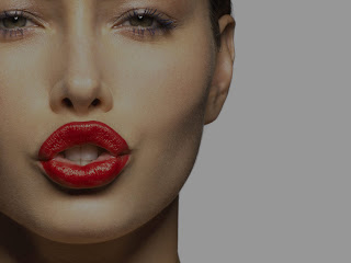
Considering I will be editing my photos from the Day of the Dead photo shoot, ready to print, I attended the Photoshop workshop to refresh and improve my skills in using the various tools the software offers. This is a simple example of the Layer Mask tool.
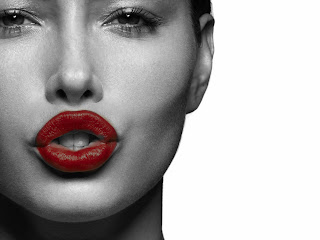


Other tools I used again were:

Healing Brush: The basic Healing tool is normally the best one to use, as the 'Spot Healing' tool doesn't give you a lot of control. The healing brush allows you to select an area you wish to duplicate and use smooth over other areas.

Dodge and Burn tools: The dodge tool allows you to whiten areas of a photo e.g. teeth, skin etc. The burn tool is good to use on hair to create a more natural colour, or make skin tone warmer or darker.

Curves and Levels You can edit the levels and curves of a photo to improve the image. For example, if your photograph is quite light and has no real depth to it, you can play around with the curves and create more shadows.

Stacking images-

Median: If you have numerous identical photos taken on a tripod, but there is crowds in each one in different positions, you can go in to 'scripts', 'load file in to stack', then open all the photos. One they have opened, you right click and make them 'smart object'. Then once this one smart object is opened, you go to 'layer', 'smart objects', 'stack mode' and select 'median', it removes the people in different positions and uses the numerous photos to give you one photo, minus the crowds.
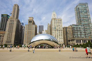


Screening: You use the same process of opening photos by 'loading in to stack', but once they are open you don't create a smart object. You click on each photo, change the selection under 'layers' from 'normal' to 'screen' and you can have each image loaded on to the one photo background. e.g. numerous photos in the same position, of different fireworks, you can add all fireworks in to the sky.

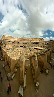
Photomerge: Go to File, Automate, Photomerge. Open your selection of similar photos (I used numerous ones of the Colosseum to experiment with) and it attempts to stitch them together and give you a more panoramic view.