I have a few live briefs lined up that I still have yet to fill out proposals for. These include:
-Promotional work for Leeds Roller Dolls.
-Badges and other merchandise for Chapters, a hardcore band.
-Hand print posters and flyers for 'Lovecuts', an all day event in Milo bar in Leeds.
-Arrange an exhibition of some from of Illustration/Photography promoting the Big Issue, and informing the pubic more about the vendors themselves.
-Work with i-am, design company
Thursday, 4 March 2010
Wednesday, 24 February 2010
Wednesday, 3 February 2010
Evaluation
When we were first briefed on Visual Language, I felt excited and motivated by the amount of ideas that sprung to mind. However, I think I let myself down by not putting all of these in to action much sooner. I spent much of the Christmas holidays deliberating over how I could use my chosen theme of taxidermy to produce something visually pleasing, interesting and different to work I have done before. Once back at college I solidified my ideas a little more by experimenting with collage and illustration, and decided to make an animation rather than a book. I chose to illustrate it because I personally prefer hand-drawn animation and enjoy doing it. However, creating over one hundred images took a lot longer than expected and as the exhibition and deadline approached, I decided I would still put the images I had together as an animation, but would also bind them in to a flipbook to have something a little more substantial than a 20 second long animation.
I was originally interested in using taxidermy as a theme so I could document individual taxidermists’ work, and find out a bit more about why and how people get in to the profession. However, I realised early on in the brief that the best way to do so would be photography and text, and neither of these appeal to me. I am definitely not a photographer and illustration just didn’t seem to be the right method to use. So instead I decided I wanted to make something less serious, and create an animation that was fairly comical but also dark. The visual story of a half-woman/half-fox creature whose own face evolves in to scissors and chops the top of her head off, then gets stuffed and stitched make the idea of taxidermy more relatable to a human and shows how vulnerable an animal can actually be.
I encountered a few problems when preparing my image sequence to be bound as a flipbook. Firstly, I had to edit each photo individually because the paper I had used to illustrate on to was slightly off-white, and therefore would have printed a strange colour on to white paper. After much repetitive playing around with levels on Photoshop and re-sizing images so they would sit on the same place on each page, I had my finished images. I have now learnt that I should never use the guillotine in college for anything I need to be completely straight, as I used the studio one to cut my pages down to size (using the crop marks I had set on InDesign) and they ended up all slightly different sizes. Fortunately I was able to even them all out in the Vernon Street print room, and the binding process was very simple and went smoothly.
Despite having my book and animation ideas sorted, I was still unsure as to what I wanted for my wall piece. I didn’t want to use any images similar to those in my animation and so decided to do something completely different, but still sticking to the theme of taxidermy. Plus, I felt I had concentrated the vast majority of my time on my flipbook and animation, that the wall piece and postcard became more of an afterthought. I’m disappointed I didn’t leave myself enough time to use a drop in session and screen print my taxidermied lady illustration, but I printed it out in the professional print room on matt A2 paper instead. I chose to use the same image for my postcard to make it more like how it is in an art gallery as I also thought from reading the brief that the postcards were to be sold.
I have some regrets about how I tackled this brief. Firstly, I wish I had documented more of my processes through photography to show the making of the flipbook in action e.g. me sitting at the light box drawing each one. I feel this gives you more of an insight in to how I made my pieces, and makes a blog more interesting to look through. Once again, I should have thought more about the time we had to complete the brief and planned around this. I should have used my time off at Christmas more wisely if I wanted to produce the standard of work I feel I am capable of. Although I am pleased with how everything came together in the end.
My flipbook is just as I wished it would be and functions pretty well. Despite not having done in time for the exhibition, I have since given it to people to trial and have had good feedback. Maybe next time I would consider a slightly less weighty paper and see if it could flip slightly easier. This brief has reminded me of what I really enjoy, which is animating. Next time I would like to try making even more detailed flipbooks of different shapes and sizes, with different binds. I’m glad I had a couple of days in the Vernon Street print room at the beginning of this brief too, as it has taught me more of what is available for me to use in the future, and how to do so through making mock up books. I am also glad that I had the opportunity to use InDesign, even if only briefly. I have been to tutorials on the programme before, but never really had to the chance to apply it to any of my work. Paul Price was extremely helpful and taught me how to fit my images to each page and prepare them for print. This is a skill I feel will be useful in the future.
The biggest thing Visual Language has shown me is that I am capable of visualising an idea and making it a reality. I often have a head filled with ideas and don’t follow them through because I underestimate myself a lot. I am definitely not completely satisfied with all my outcomes of this brief, as I’m still trying to learn the best way to utilize my time and make the best of myself. But I am very happy with my flipbook, which was what I focused on the most.
Tuesday, 2 February 2010
Binding my Book
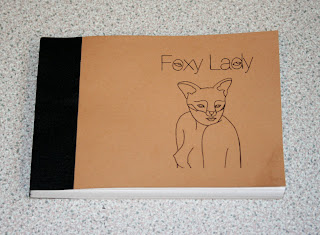
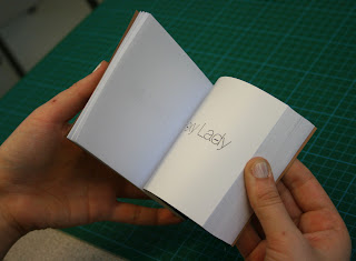
After laying out each page using a template on InDesign, I then printed them out on plain A4 paper (the front and back cover printed on brown paper). Because I couldn't use any of the facilities in Vernon Street until a couple of days before the deadline, I began cutting my pages down in groups of 10 at a time, using the college guillotine (which was a very bad idea as it was extremely blunt). The next day I went to Vernon Street in the morning and began to bind my book. I used a perfect bind, as this was the simplest way to bind a chunky flip book like mine. I did this by:
1. lining up the pages at the side where they will be bind, placing them between two pieces of card, and clamping them in a big metal press.
2. Use a tool to make small incisions every few millimeters all the way along the edge. (This is to ensure the glue gets to all the pages, as they were not 100% in line with each other).
3. Put a thin layer of glue along the binding edge and leave to dry. Then repeat this 3 times.
4. Once dry, I took the glued pages out of the press and glued one side of my front and back cover and stuck on.
5. Finally, I chose black material to measure and then glue around the bind, to keep it in place and hide the edge.
Right at the end, I used one of the guillotines to chop along the other 3 sides to make the book perfectly straight. It flips surprisingly well and am very pleased with the way it has turned out.


Monday, 1 February 2010
Postcard
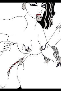
I decided to use my wall piece as my postcard image too, like in a gallery when you can purchase postcards of artwork you have seen and liked. It was simple enough to fit on to an A5 size canvas in Photoshop, but I didn't want to stretch the image and was left with white bands at the top and bottom of the image. I decided to fill them black to frame the piece and make it very slightly different from my big piece.

Making an Intro
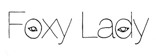
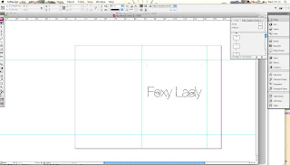
When I put my series of images together at 6 frames per second on Quicktime, it was only 16 seconds long (which was expected because it was made to be a flip book) and I wanted it to just be a couple of seconds longer. Plus I realised it went in to the animation way too quickly. It needed a short intro, with just the name of the piece. So I printed out the words 'Foxy Lady' in Helvetica Neue Light, and traced over it a few times, and added fox eyes in the 'o's to blink as it played. I'm going to bind this introduction in to my flipbook too, as a few opening pages to introduce it.

Choosing a Size
I have made a flip book before, but that was on my BTEC course and was done very unprofessionally. Therefore I'm struggling with knowing what would be a good size to make it. I went and spoke to Neil in Vernon street about what kind of size and he said what everyone else has said: it has to be comfortable to hold and flip. I feel like I want someone to just tell me a size to make it all easier. But I think I'm going to make it 148mm x 105mm, as just judging from a looking at a piece of paper that size it looks like it could work. It's also a similar size to other flip books I've seen and tried. I'm going to Japanese stitch it so the binding shouldn't interfere with the front page.
Adding Music in Quicktime
After making my image sequence in to a Quicktime movie, I still needed to add some music to it. This was easy enough to do, as I could also capture the exact part of the song I wanted by opening it in Quicktime and moving the cursors at the bottom and saving it as a new file. I then just copied it and added it to the movie. Simple. Quicktime really saved me on this project, as I needed to put it all together really last minute and upload it to the show reel.
Using Quicktime
Considering I left putting the animation together until the very last minute, I decided to use Quicktime to select a image sequence. I had a problem though, because they have to be numbered in the correct order to be put together and as I added my intro afterwards, I had to re-number all the image from 1- 115. It was a really laborious process, but once done the animation was done in a couple of seconds.
When it comes to uploading my animation I may have to try and export it using Final Cut, because it is a wierd portrait size and you can add black bars down the side in Final Cut to make it the correct size to upload.
When it comes to uploading my animation I may have to try and export it using Final Cut, because it is a wierd portrait size and you can add black bars down the side in Final Cut to make it the correct size to upload.
Saturday, 30 January 2010
The Exhibition
The days leading up to the exhibition, everyone appeared very stressed and rushed with preparing work to put up/ finishing book etc. But once it was up, the work was really impressive and felt proud to be on Viscom. However, I was not happy with my work and wished I had submitted a piece that I felt represented my full potential better.
In the day time I helped hang one of the walls with pieces, which I think was good practice if I ever have the chance to help curate or put up a show of my own in the future.
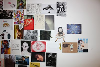

In the day time I helped hang one of the walls with pieces, which I think was good practice if I ever have the chance to help curate or put up a show of my own in the future.


Thursday, 28 January 2010
Foxy Lady Animation
Here is my animation that I prepared for the show reel. I made it in Quicktime, but then had to export it using Final Cut because Youtube and Blogspot could not recognise the Quicktime file. It works now though.
Wednesday, 27 January 2010
InDesign
I have been to a couple of Indesign tutorials before, but never have I had the chance to use it for my work before now. All my knowledge of the program had completely gone and Paul Price helped me out massively. Although I had all of my images prepared in Photoshop, they weren't on the page sized I wanted and so decided to make a master page on InDesign of the correct size and place each individual image in to a box on the pages. This turned out to be very simple to do and much quicker than if I had tried to do it on Photoshop. It was also really handy to have the crop marks on each page so i knew where to cut and crop.

Drawing and Drawing and Drawing...
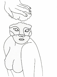
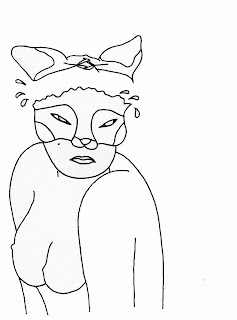
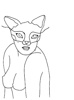
Finally have all of the images done. There's 99 of them. And not once do I want to draw the fox/lady one more time. I think I will still put these together as a real short animation to put on the show reel, but will look much better as a flip book when i have the chance to bind it. Having a light box is really super useful as it's easy to constantly manipulate the images and crate the movement. Here are some more individual images from the flip book.


Sunday, 24 January 2010
Making my images black and white
Because I hand drew my illustrations they weren't pure black and white when I scanned them in. Therefore, I had to change the levels of each one. I started off using the white paint bucket to fill in each image, but fortunately realised a few of images in, that this was a very unnecessarily long way to do so. In a couple of the images it is still very slightly noticeable that areas are off-white, but in amongst the many flip book pages they hopefully go unnoticed.
Saturday, 23 January 2010
Simple, Cool Flip Books...
The first flip book I found below is a pretty sick idea. Real simple, but probably took a while being so precise with the cutting out. The one beneath that is just done really well. The movement has been drawn really gradually and brings the image out of the page.
Saving as Pdf/Jpeg
After scanning in 99 images, and saving them all as Photo shop files, I realised that this was a bad idea. I did this because I vaguely recall one of the computer room technicians telling me to do so, but they took up so much room on my computer and I wasn't able to save them to my memory stick.
Next time, I would just save as jpeg as I don't see any real benefit in saving them as anything else for what I'm doing.
Next time, I would just save as jpeg as I don't see any real benefit in saving them as anything else for what I'm doing.
Unfolding Storyline...
As I said before, I prefer not to plan a lot of my hand drawn illustration as it tend to take a more interesting path if I don't. However, I've felt slightly stunted whilst doing this one. I knew what I wanted to begin with (a half-woman/half-fox) and end with (a stuffed and repositioned half-woman/half-fox) but the process of getting between the two was fairly difficult. It was handy using line drawing though, because I could play about with the lines of the fox face to create scissors, which then cut off the ears of the fox-lady and so on.....
Light Box
So, whilst I've been a slave to my fine liner and a light box, repetitively banging out pretty much the same image over and over again, I realised I would really benefit from an A3 one. The one I have is only slightly bigger than A4 and makes it difficult to draw certain angles perfectly as the wooden sides get in the way. I also wish now I had taken more care over each illustration, as there's a clear deterioration in the standard and clarity of image. It's jut real hard when repeating the same thing so many times to remain careful over each one.
Oh well, at least I know for next time to be more patient with the whole process. I also was using pages from an empty ring-bound sketch book I have, which meant that each page has whole punctured at the top, making it harder to line up each piece (which makes it easier when scanning and re-sizing).
Oh well, at least I know for next time to be more patient with the whole process. I also was using pages from an empty ring-bound sketch book I have, which meant that each page has whole punctured at the top, making it harder to line up each piece (which makes it easier when scanning and re-sizing).
Thursday, 21 January 2010
foxy lady
When I make an animation, I prefer not to story board. I find it turns out more interestingly if I just let myself create the movement as I go along and see where it goes. I obviously begin with a rough idea of what I want, and I knew I wanted to start with a lady with a fox's head. Here is a simple line drawn still from the series of images.
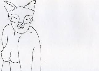
I think I will have her tortured/in pain some how, and end up being stitched up in some way.

I think I will have her tortured/in pain some how, and end up being stitched up in some way.
Wednesday, 20 January 2010
Cropping
Playing Around
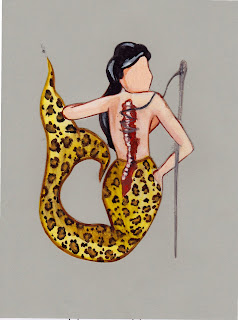
Originally I had an idea to create lots of tiny oil painted creatures for the exhibition, but decided against it in the end. I didn't really fully think through the idea of this miniature piece first, but wanted to incorporate animal and human in a different way to the common idea by a few artists at the moment, which is to take various parts from different animals and fix/draw them together.
This was just a trial and it didn't turn out how I had hoped. I didn't want to give her a face because i wasn't satisfied with it, and therefore should remain without an identity. It was nice to play around with oil paints again though, even if it was only very simply.
This was just a trial and it didn't turn out how I had hoped. I didn't want to give her a face because i wasn't satisfied with it, and therefore should remain without an identity. It was nice to play around with oil paints again though, even if it was only very simply.

Flip Book
Again, change of mind about what I want my 'book' to take form as. I now want to turn my illustration stills in to a flip book. Firstly, because I think the simplistic, hand drawn style of my images would suit something more personable and interactive like a flip book, and secondly because it will require less images than an animation would and means I won't have to rush as much to get it finished for the exhibition.
I haven't yet finished drawing all the images, but went in to uni today and scanned in the ones I did have to check with the computer room guys that I was going about it in the right way. First of all I scanned all my images in using 'easy mode' on the scanner, which was a bad idea because even though I had aligned my images to sit in the same place on each page, the scanner picked them up in all different positions and I then had to re scan them all in 'professional mode' so I can choose the scanned area and crop it so they were all the same.
I haven't yet finished drawing all the images, but went in to uni today and scanned in the ones I did have to check with the computer room guys that I was going about it in the right way. First of all I scanned all my images in using 'easy mode' on the scanner, which was a bad idea because even though I had aligned my images to sit in the same place on each page, the scanner picked them up in all different positions and I then had to re scan them all in 'professional mode' so I can choose the scanned area and crop it so they were all the same.
Illustration for Wall Piece
I wanted to stick with the theme of taxidermy for my wall piece, but didn't want to use the same style as that used in my flip book/animation. I used a similar style of illustration to the one I used on my printed t-shirts last year, hopefully becoming slightly recognizable? I drew a naked lady with fish hooks through her nipples and stuffing coming out of her mouth, ears and insides. I wanted to put a human in a vunerable state and stuffed, just like an animal, while also being made to look 'sexy'. Obviously with the taxidermied animals they are posed in a way that is appealing to the eye and makes them appear life-like.
Monday, 18 January 2010
Massive creativity block......
Ok, so after having some time off at Christmas and letting my mind drift far away from the idea of producing some work, I have had a period of stressing out about the amount of time left before the deadline and how much there is to do. I also began doubting my chosen theme of taxidermy.....attempting to come up with a content for a book around the idea became very difficult, and thus proved that maybe it wasn't the best idea for me to produce a book.
I chose to stick with taxidermy but take a different approach. I am going to began drawing the stills for an illustrated animation. I feel this leaves so much more room for creativity and playing about with different things and is something I feel I will enjoy much much more than binding a book....
we'll see how it goes.
Subscribe to:
Posts (Atom)


